


Media evaluation from cowlinge
Additional Ancillary Products:
Alongside my promotional package, I wanted to create a Starbucks downloadable card, this is because the idea of coffee shops and new music are typical conventions associated with the Indie Genre. I also know that Starbucks is popular with our generation, and as that was our target market I felt that the Starbucks promotion card really would aid to promote our star- even though this wasn't in the brief. I wanted to include this as it would influence me to listen to similar artists.
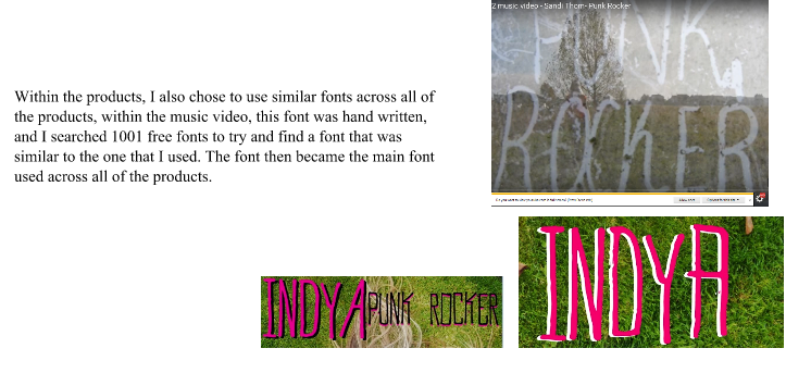
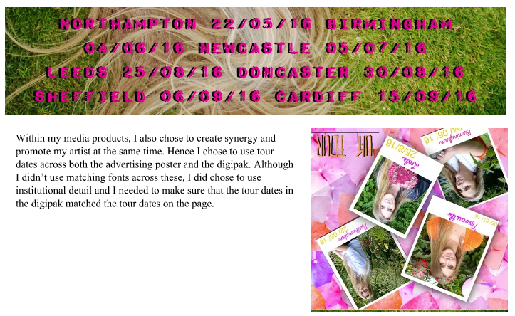
In order to create synergy with this promotional media as well, I chose to use the same font I had used across my digipak and advert- the font "Must Print Clearly" which I downloaded of 1001 free fonts. I used this font as I felt that it looked professional and was an easy font to read. I also made some parts of this font green to create synergy with the rural settings used across both my music video and promotional package.
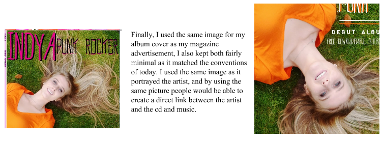
Finally, in order to create a direct link with our artist, I used the front cover of our digipak, this is as it could be directly associated with Indya and it gave our audience an insight into Indya's character and the sort of music she would be singing. Promoting our star further.


No comments:
Post a Comment