Wednesday 22 July 2015

Research: We the Kings- Say you like me- Slidely


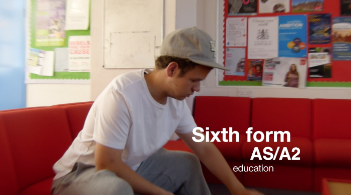
A2 music video analysis by Slidely Slideshow
The We the Kings- Say You Like Me music video follows a very typical plot which adheres to Vladimir Propp. I.e., the idea of a hero, a princess and a villain. In the music video, unintentionally, the girl is perceived to be weaker and needs to be saved, yet this still results in a twist towards the end. When the girl takes over and saves herself. Which then adheres to the idea of liberal feminism- as she doesn't need a man to look after her.
However, the music video, yet following a traditional plot, is incredibly modern, and follows a video game like system, and is a combination of both real life actors, (the girl and the band members) and cartoon elements (pop art style backgrounds, video game elements and the story villain. It suggests that the video is aimed at a younger audience, due to its heavy references to popular culture, however, it also creates intertextuality as it is all reference to popular video games- such as Guitar Hero- the music video provides the message that young teenagers are heavily effected by the games they play and the films they watch on TV. The music video also uses lots of split screens and freeze frames, providing different perspectives as well as more time to take in what's happening on the screen. I like the use of the split screens, however, I feel that it would be difficult to make this look professional when making our own music videos. Also, the locations in the music video would be difficult for us to replicate, as the majority is filmed in a built up area of America and a beach hut, both of which we don't really have access to in North Lincolnshire!
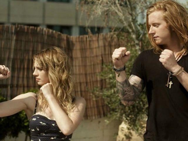
Finally, I like the image created by the artists themselves, they are alternative, but quirky and young, all of them showing off tattoos and some with long hair and piercings- providing them with a popular, quirky, youthful image. I feel that their looks would be fairly simple to replicate, they were natural makeup, checked shirts- and temporary tattoos are easy to find. I feel that I would like to explore band image more in my work.
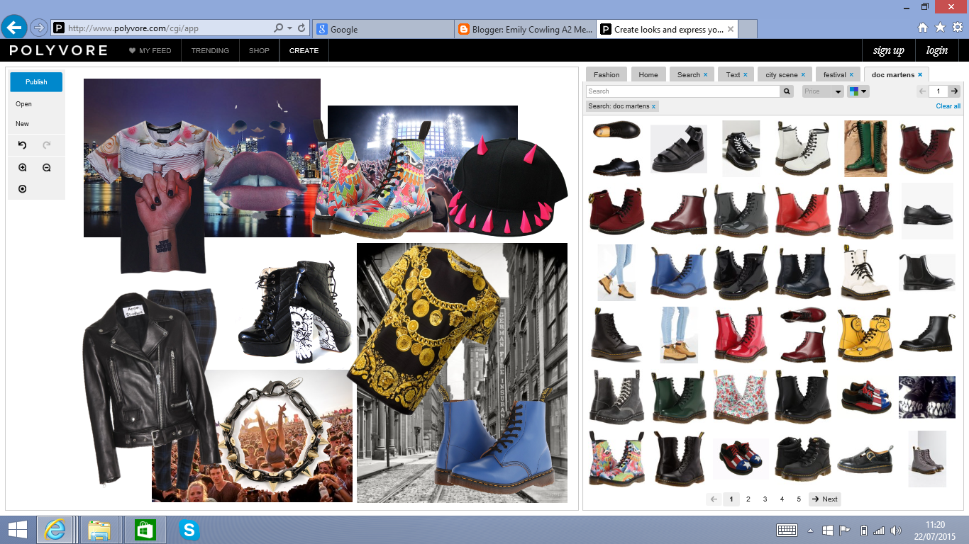
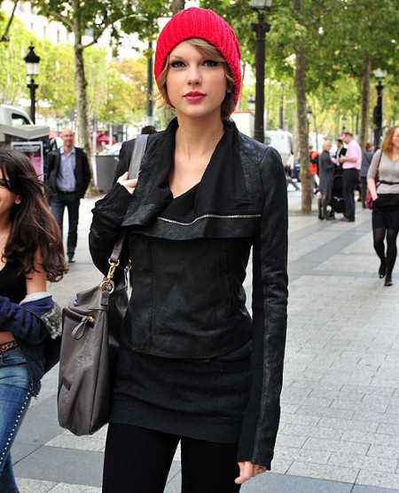

Research:Woodstock- Lemons, music video analysis


research and planning: The Punk Genre: Costuming


I then went on to research the Punk genre as well, this is as we were going to make a Punk/ Indie music video. The most iconic item of clothing when it comes to the Punk Genre is by far the leather jacket, the leather jacket has been a statement item of clothing for decades and is iconic. Hence, why I feel that a leather jacket should be a must when filming a Punk/ Indie music video.
I then went to search for celebrities wearing leather jackets and I found this image of Cheryl Fernandez- Versini wearing a leather jacket, Cheryl is popular within Britain, being one of the judges on X Factor and being a pop star, everyone knows of Cheryl , and the majority of her fans want to look like her.
I then went on to look for celebrities wearing Doc Martens- these chunky boots have been popular since the 70's, however they are slowly becoming more and more popular with the grunge scene over the years. I found this image of Katy Perry wearing doc martens, Katy Perry also wears them in quite an indie way with  a statement dress and knee high socks- a cute and quirky festival like look, I like this look especially as I feel that it combines both aspects of the indie look, such as the flowery dress, with punk aspects, I.e. the doc marten boots and the black knee high socks.


I also went on to look at makeup looks, and Punk makeup looks are key in making a statement, hence this image of Demi Lovato wearing black lipstick.  I feel that I could definitely experiment with eye makeup and lipsticks in order to create new and unusual looks within my music video, however, I wouldn't want to make them too out there, this is because a key part in the costuming and makeup is that they can be replicated, I want to create unusual looks that can still be replicated.

Planning and Research: Indie Costume Analysis


Indie Culture is becoming more and more wide spread- in particular within casual wear worn by celebrities- I created a mood board on Polyvore and then tried to find images of celebrities wearing typical indie clothing. This is as I feel that people are inspired by what they see in the media, whether that be in magazines, music videos or outfits worn by celebrities, captured by the media.
The first item I searched for was converse, I found many celebrities wearing them, including Fearne Cotton, Fearne Cotton is popular on English television, hence, the British public see her in the media a lot and want to look like her, after seeing Fearne Cotton wearing converse, her fan base may want to find similar converse so that they can look like her.
Then, to the right I decided to search for beanie hats, particularly as our music videos would be filmed within the autumn months, so keeping warm would be a must when we were filming, beanie hats are becoming more and more iconic and are popular within the indie/hipster fashion industry. So I then decided to search for celebrities wearing beanie hats and found this image of Taylor Swift- a popular country singer in both here and America, Taylor Swift is also incredibly popular with many teenagers and is pictured in many teenage magazines. Hence the idea that Taylor Swift's fan base want to look and dress like her, so they try to find outfits that are similar to Taylor Swift so that they can replicate them.

I then went to looking for the most iconic item of indie fashion in todays modern age, however, it was also popular with the Mods and has simply made a return to fashion: The parka coat. I also feel that parka coats would act similarly to the beanie hats, in the fact that we would be making our music videos within the autumn months. I went to look for parka coats and found this image of Kate Moss wearing a parka coat. Kate Moss is a famous model and advertises for many brands- making her popular within the public eye- whatever celebrities such as Kate Moss wears, become fashion, I think that I should include at least one of these in our music videos.

Friday 17 July 2015

Using Final Cut Pro X

 First Attempts at Using Final Cut Pro X
Within Final Cut Pro X, we began to create a sixth form video, hence we filmed short clips around sixth form in varying locations, we filmed outside, in the dining sort of area, on the stairs on the way up to the media and english block, the work room in sixth form, the pigeon hole area in sixth form and the common room. We also tried to take varying shots ranging from close ups, to extreme close ups, to wide angle shots. We then had to work out which shots where the best ones, and the ones we then wanted to use in our sixth form video.
We then went on to find the transitions section of Final Cut Pro , however, the majority of the transitions that we wanted to use were cuts, this is because simple cuts are a convention of most music videos. However, we did try to break convention in some areas, hence the use of a fade between a shot we took of the work room and the common room this is as it appeared to create a match cut. I feel that I would like to experiment more with different cuts in the lead up to my music video to work out which ones are the most effective. Although I like the different transitions within the section, I feel that the majority break convention to much, such as the swing and the swap- and therefore wouldn't appear to match up in the music video that we would want to make look professional.
We also went on to play around with different vignettes and putting images in the background, here we used a over the shoulder shot of us filming the music videos, and then placed an extreme close up of Patrick playing cards in the background, although I liked the effect this had, I felt that it made it appear to busy and you couldn't find a focal point within the video to focus on.
We also went on to add intro credits to the video, we used the phrase "Sixth Form AS/A2 education" and put them on in different places and sizes in order to make the clip more visually interesting, it also added movement to what was a static clip of the pigeon holes at sixth form. However, we did begin to notice that we had a smudge on our camera lens in the top left corner when we started filming.
We also added in a clip to the beginning of the video that we found whilst experimenting with Final Cut ProX of an ink blob which rushed around the screen, it helped to make the introduction of the song "Bright Eyes- best day of my life" more interesting as there obviously wasn't any lyrics in the introduction. We also added in the life at Brigg Sixth Form text which we managed to cut on the beat.
Within these two shots, a wide shot of Patrick and an extreme close up of Patrick playing cards, we managed to create continuity editing, we also used these two shots as they were fairly natural and weren't staged, it made the whole video appear more relaxed. We also continued with the Sixth Form text for the continuity editing as well as the music which created a sound bridge between the two shots within the music video.
To achieve continuity editing, we bladed the clip of Patrick, just as he put his hand on the table t put a card down, we then added in the zoom in of the card shot and bladed that to focus on Patricks hand on the beginning, in order to make the transition between the two clips seem seamless. We also used the video clip of Patrick with the playing cards in the background of our vignette shot in order to add more dimension.
Within Final Cut Pro X, we had a play around with speed and reversing in order to make the video more unusual.


Using final cut Pro x has really opened up my eyes to the wonders of Final Cut and how it can work wonders on different types of footage, however, it has also taught me how complicated the software can be and the different short cuts, I do like how there are lots of transitions and different effects to work with.


Sandi Thom: Punk Rocker- Lyrics Analysis Mood Board

This is a thought shower I created from reading the lyrics to Sandi Thom- Punk Rocker, I used Polyvore and grouped together a mixture of aspects I thought of that related to the song, such as flowers, guitars and radios, however, I also tried to add in ideas for costuming, such as heavy boots, leather jackets and the idea of putting flowers in her hair.

Planning: Sandi Thom- Punk Rocker Lyrics

[Chorus]
Oh I wish I was a punk rocker with flowers in my hair
In 77 and 69 revolution was in the air
I was born too late into a world that doesn't care
Oh I wish I was a punk rocker with flowers in my hair

When the head of state didn't play guitar,
Not everybody drove a car,
When music really mattered and when radio was king,
When accountants didn't have control
And the media couldn't buy your soul
And computers were still scary and we didn’t know everything

[Chorus]

When pop-stars still remained a myth
And ignorance could still be bliss
And when God Saved the Queen she turned a whiter shade of pale
When my mom and dad were in their teens
And anarchy was still a dream
And the only way to stay in touch was a letter in the mail

[Chorus]

When record shops were still on top
And vinyl was all that they stocked
And the super info highway was still drifting out in space
Kids were wearing hand me downs,
And playing games meant kick around
And footballers still had long hair and dirt across their face

[Chorus]

I was born too late to a world that doesn't care
Oh I wish I was a punk rocker with flowers in my hair

Planning: Trying to gain permission from Sony Music Licensing


This was the email that we sent to Sony Music Entertainment via the Sony Music Licensing website, however, this was fairly difficult to do as we were limited to 350 characters, hence we had to make our email straight to the point.

Monday 13 July 2015

Barney Rubble- The Twang- Mood Board

Here is my moodboard to Barney Rubble- The Twang done on Polyvore, the whole song has quite a chilled out but still upbeat vintage vibe to it, so within this moodboard I tried to incorporate lots of quirky vintage items with a dated colour scheme- most of the items are almost quite childlike and jumbled in appearance, but work together as a whole.

James Vincent McMorrow- Higher Love Mood Board

Within this song, the lyrics are quite slow and its based of an older song, so with in this music video I decided to combine both 80's style clothing with outdoors clothing- this is because I felt that together, they both had good synergy, however, I decided to add in pops of bright colour, this is as I thought that the main singer could wear them to make them stand out.

Matt Nathanson- All We Are Polyvore Mood Board

This is my Matt Nathanson inspired mood board, I chose to make this one more rock and roll esque however with some quirky features, such as the rainbow sneakers and the bronze figurine- to make the music video more quirky and unique, however, I also kept more traditional features such as the love hearts- this is as the song is stereotypically a love song.

Planning: Sandi Thom- Punk Rocker Music Video Ideas Mood Board

Within this Polyvore, I wanted to explore ideas for what I would like to put in a music video to Sandi Thom Punk Rocker, I feel that I would like to use a mixture of both Indie and Punk- to combine the two, whilst keeping the background of the music video fairly plain and natural- like a field as I feel that it would complement the indie look.

Friday 10 July 2015

Research: Independent Record label Logo Analysis.

 1. RHYMESAYERS ENTERTAINMENT
The brand name "Rhymesayers" gives the company a lot of freedom in terms of choosing what they want to be featured in their logo as it doesn't have a lot of connotations, however, I wouldn't say that it is as memorable as other names. Within the logo itself I like the monochrome colour scheme as it makes it very sleek and sophisticated, I also like the image, this is as its similar to a coat of arms, this could suggest that "Rhymesayer" is the last name of the founder of the company.
 2. 4AD
This logo also gives the company lots of freedom in choosing the design of their logo as the name doesn't give it a lot to go off. However "AD" means "Anno Domini " in literal respects, this connotes the idea of being old, this could lead to suggests that 4AD feel that the music they produce is timeless. Once again I also like the sleek minimalistic feel of the colour scheme, as well as the vintage esque font that is used in the logo of 4AD.
 3. MATADOR
This logo has connotations of Spain and bull fighting- connoting quite an exotic feel. This logo also features colour, with a purple gradient, it gives the impression of depth and makes the logo appear 3D- like the cloth used in a bull fighting arena, however, you would therefore expect the font to be in red, but the purples connote a more cool and tranquil feel, it makes the music label appear more relaxed and timeless. This logo is also fairly simple, which makes it easy to reproduce in advertising.
 4. MAD ACCENT
This logo is  a lot bolder then the others and uses contrasting colours, in my opinion, the use of the gold and pink, with the dynamic font connotes a "gangster" type feel- to me, from looking at the logo I would immediately associate the company with rap music, hence i am not keen on this logo and I don't feel that it is the sort of logo that I would like to use within my own logo, I like the colours, just not the connotations that it comes with.


5. XL RECORDINGS
This logo is incredibly dynamic and bold due to the large fonts, the use of 'XL' also creates synergy with the size of the font used. I also like the fact that this logo uses different types of font, this is as it breaks convention as the majority only use one type of font. I also like the monochrome colour scheme in this logo, I feel that it is something that I would like to do within my own logo as it seems to work well.

6.SUBPOP
I feel that this is one of the more abstract names for a record company and the use of 'sub' suggests that they focus more on Pop artists that haven't been discovered yet. However, in this logo I like the use of a black background, its really dynamic and makes it stand out. "Subpop' is also memorable, due to it being a short, snappy, made up name. The use of the black and white also creates a contrast between the lettering used within the logo.
 7.JAG
This is also a more abstract logo, due to the fact that the word used is made up 'JAG', the use of "JAG" however makes it short and snappy- the logo is more memorable as its simple and unique. The logo's simplicity also means that it can be recreated on a vast scale on many different media products. Once again, I also like the black and white colour scheme as it makes the logo sleek and stylish.
 8.FOOLS GOLD
This is one of the more unusual logos as it is more graphic based, however, in this logo, I really like the font as it is bolder and more cartoon esque. I also like the yellow on black as it is unusual but its still really effective. Within this logo, the text and the image are synergous and work together, the dimensions of the image also make it appear 3D as if the logo is set back in the computer screen, making it stand out and providing a sense of movement within the image.
9.GLASSNOTE
 The use of note in the title links directly with music, something that none of the other logos do really, this is exxagerated by the use of the image within the logo. I also like the large G in the logo as it makes the image memorable and is very simplistic, meaning that it could be recreated easily on different media products. I also like the bubble-esque nature of the font as it makes the logo feel more youthful and bubbly. The logo is dynamic and memorable without having to be overworked.
10. STONES THROW
Within this logo, I feel that it is similar to some of the more traditional logos of different artists from the 70s and 80's due to the circular background, I also like the use of the white text on the black background as it means that the text would stand out well against any background, whatever background the text is on, you should be able to see the white text. I also like the simplistic shapes used within the logo.


Within this research, I feel that I would not like to use bright colours within my logo, this is as I feel that the black and white logos look much more sleek and sophisticated, I also like the more simpler logos as I feel that they could be recreated easily on different media products as well as the fact that I feel that they are much easier to recognise.

Research: Music Label Advertising


Within my Research, I found that predominantly, the advertising used on music label websites was for young adults- probably about the 18-21 age range. The advertising used is also predominantly aimed at both males and females as well in order to widen the target market. Across the top of "top 25 independent music labels" There was an advert for Kopparberg cider, stereotypically, this is an advert for young males who have just been able to start drinking, the advert stretched across the whole of the website- meaning that it had to be noticed. The second advert was for Revlon Colorstay Gel Envy Nail polish, this wasn't used as often as the Kopparberg advert. It was used once on the master page towards the left hand side, stereotypically, this is aimed at females, however, the fact that the website doesn't use this advert as much, suggests that investors from Kopparberg paid more for advertising then Revlon, the more an investor pays, the more their product is advertised across the website.


How research has informed my planning and creativity: Although we are in a world of gender equality, there is still a clear divide in terms of which adverts attract which gender, I feel that in our digipak I would like to completely oppose this, by using advertisements that would appeal to both genders for a gender neutral look, this is as it would appeal to feminists- who are a key social group in this age.

Developing Skills:Filming and Procut X

This morning, we attempted to do some filming for the first time, we used the Panasonic DMC-FZ62 which we had set on P and we filmed in the format AVCHD. However, filming for the first time was difficult, this is because we hadn't done any storyboarding, which meant that we had to almost make up the shots as we went along- although this meant that we were able to experiment with different shots and see what works and what doesn't, it meant we didn't have much of a direction to go with. We experimented with different shot types, including close ups, wide angle shots, panning, over the shoulder shots and two shots. However, I found certain aspects of panning difficult, this is as we had to try and keep the tripod in one position to make the shot smooth, whilst attempting to make the pan not too quick or too slow, I feel that to make this work I need to experiment with it more in order to make the shot more soundless. I would also like to experiment with over and under cranking.

Research: Rough Trade Records Institution