Monday 28 September 2015
Research: Sandi Thom- Punk Rocker
Inspiration: Sandi Thom wrote Punk Rocker after getting her phone stolen on a night out, along with other belongings, and the process of this got her thinking, "I wondered if that had happened to me back in the days of the hippies what would I have done and would I have freaked out so much?" - Sandi had no way of communicating with her friends and family.
However, there has also been lots of discussion about the song itself- it is rumoured that Thom was an anarchist, and wanted anarchy about technology.
The song itself also got lots of criticism, from many music artists of the time, including Lily Allen, The Fratellis and The Automatic. Members of The Automatic had a lot to say about Thom's song. "If she was a punk rocker with flowers in her hair she'd get the shit kicked out of her by other punk rockers, for having flowers in her hair. [...] I haven't found anyone who's told me they like that song and bought it."
The song itself has lots of contrasting views an opinions- people tended to either love the song or hate it!, creating a massive contrast.
However, even with all this contradiction and up roar, the single sold over 39,000 copies in its first week, and managed to reach number 1. The song was nominated for song of the year, however lost out to Take That- Patience.
Research: Bricolage
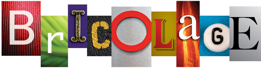
Bricolage is the method of combining different D.I.Y elements in order to create a new object, Bricolage represents the idea of creating something new out of different smaller objects or lots of old and unusual objects in order to create something new and interesting, its all about texture and shape. Many artists use Bricolage within collage and sculpture work- Bricolage is also now associated with the shabby- chic movement.
Research: How research has influenced by planning and creativity: Woodstock- Lemons
Within this music video, I like the look of the simplistic props- how everything looks simplistic and home-made, it makes the overall appearance of the music video very rustic and quite indie, the use of simplistic props also creates lots of signs and symbols within the video- the idea of objects being made to look like something else.
Planning: Indie Record Label Designs


These Indie Record Labels were created on PhotoShop Elements 11- We are going to do a questionarre to work out which logo people prefer.
Saturday 26 September 2015
Research: Ke$ha cannibal digipak
 Ke$ha- Cannibal Digipak
Ke$ha's Cannibal digipak clearly represents her brand image, it shows her off as an edgy, strong and powerful individual. I feel that we should represent Indya's brand image within our digipak.
Within the cover of the digipak, I like the appearance of the two different makeup looks on Ke$ha, it shows her as two different contrasting individuals- as if they have contrasting personalities. Or the media perception of Ke$ha and the real Ke$ha.
Ke$ha also supports Laura Mulvey's male gaze theory, Ke$ha appears to be voyeuristic- but at the same time, strong and powerful, this could be represented by the two contrasting images on the album cover, one being the media's representation of Ke$ha as being sexual in the way she looks, and the other's Ke$ha's personality, shes bold, strong, independent and post- modern.
On the front of the album cover, contrasting colors are used with the blue and yellow, the two colors stand out against each other and make each other look good- a concept used commonly in the art industry.The yellow also creates synergy with the yellow in the text amongst various pages, the yellow is also more of a gold color- gold connotes power and money- it promotes a more glamorous form of lifestyle.
Within the digipak, more voyeuristic images of Ke$ha appear, in both performance and studio shots, they connote Ke$ha as powerful and also show of her appearance and brand image.
The iconic symbol the american flag is also used within the background of the central pages, this once again symbolizes Ke$ha's power and identity. However, the american flag is also a symbol of Freedom, which again represents Ke$ha- Ke$ha is free to wear what she wants and to perform in a way that she wants to.
This digipak also shares similarities with The Killer's digipak, they both use ripped paper across the pages to make them appear grungy and home made, I also feel that this represents power, the ripping of paper is an aggressive action- and you can't rip it in a particular way- its a spontaneous and powerful action.
This has inspired my creativity through the use of signs and symbols, and things that are iconic,I feel that these would be interesting to use in our digipak.
Research: The Killers Digipak

This is one of my favourite digipaks that I have seen, I like the merge of both the abstract shots and the shots of the artist. Within this digipak, the synergy comes from the colour scheme- the use of the black and white, this makes the digipak look timeless and classic- but it also creates a grungy and urban vibe. It also makes the red font on the front and back of the digipak stand out- this makes this font much bolder and vibrant- however, it also reminds me of danger and power- red and black are also a classic and timeless and colour combination.
Within the digipak, I also like the synergy created within the artists- they are all wearing black- which creates a vibe of mystery, as well as making them look cool and trendy. Within the digipak, I also like how home made it looks, the inside uses a technique similar to that done in a mood board- it connects three ripped pieces of paper together, they all contrast but once again are connected by the use of the black and white colour scheme. I also feel that this uses intertextuality- as the red hot chilli peppers used a similar black and white desert landscape as the location of their music video.
Finally, I like the image they have used on the CD cover, although it appears to show no link with the Killers themselves, the shape of the rams head is cleverly used, this is as the shape of its antlers fit round the inside of the CD- it almost makes the CD cover look like a piece of art work- I feel that I would like to play around with this idea in my Digipak.
This digipak has informed my planning and creativity through the use of the muted colour scheme- although it looks classic and edgy- which I like, I don't think that it suits our genre of music. I also like the graphic on the CD, it makes it look unusual and abstract- and more like an illustration or artwork rather than a CD
Research: Jay-Z and Linkin Park Digipak
Jay Z and Linkin Park Digipak
 |
Jay Z and Linkin Park digipak
|
Within this digipak , it follows similar synergy to the previous digipak I looked at, they both use a light brown colour across the digipak in order to make the digipak appear rustic and homemade. I feel that these two albums both use this colour as the artists are made up of males- and the browns and darker colours are quite often stereotyped as being masculine. With our artist being a female- I don't really think that these are the sorts of colours we would want to be using within our digipak.
Jay-Z is traditionally associated with rap music, hence I feel that this is why the spray paint graffiti has been used across the digipak, graffiti is a stereotypical connotation of the rap industry, although it makes the album clearly connect to the rap culture- I don't think that the idea of graffiti is something we should use within our music video- its to graphic, urban and over powering.
Within the digipak, I like that they have used a different colour for the background of the back piece, the white makes the font on the page easy to read, however, I think that this would be easier if the font was in a different layout, the fact the font is in two columns in different directions makes it difficult to read in my opinion.
Finally, I like that the artists have matched the CD itself to the digipak- it provides synergy, and the text on the CD means that you can automatically associate the CD with the artist- in case you misplaced the CD. You don't have to worry about which artist our album the CD is from if you misplace the digipak.
I don't feel that this digipak is incredibly beneficial to us, this is because it is a different genre and has a different target audience- I would say that this digipak is typically for males who are interested in rap music- and that isn't the target market we are looking for. However, one idea I can take from this is the fact that the digipak and the CD are synergistic and you can associate them both with each other.
Research: DigiPak Analysis
JP Harris Tough Choices- I'll Keep Calling

Within this digipak, I feel that it is incredibly synergistic, all of the different pages for the album's Digipak go together in order to create a universal piece. The synergy also aids to create a continuous flow throughout the cover using the cool brown tones, starting from JP- Harris' hat to the backgrounds of the other pages.
Within the cover, I also like the use of the cartoonist, illustrative style, I feel that it makes the album cover look home- made yet professional- it also adds to the indie/ country vibe that the album is giving off- the idea of having hand drawn aspects within the album also breaks convention- this is as the majority of album covers are photographic or composed of heavy computer based graphics.
The digipak also uses a cool brown colour scheme which I think relates the cover to nature and dirt- it makes the album cover appear rustic- I also feel that it creates the idea of a country genre- along with the heavy loader trucks- I feel that it gives the impression of the deep south within America.
I also like the black font used on the insides and back of the album, this is as it provides heavy contrast between that and the background and makes it easier to read. The font is also in varying sizes- showing which aspects of the text is more important- this font demands your attention. On the inside of the album, the font is centralised, this is in order to use up the spaces of the album- it leaves as little blank space as possible.
The album also adheres to convention on the back, the font follows from the left hand side, this is as it is easier to read as it is the typical route that you read writing from, this is as it directs your attention across the text- rather than making your attention flutter between its different aspects.
The digipak also adheres to convention through the use of a barcode on the back- this is a must for our digipak, along with the price as the possible target market needs to know how much the product is before they purchase it. This is probably something we would need to test with our target market in order to see how much they would be willing to pay for a CD.
This digipak has influenced my planning and creativity as I like the use of synergy within the album as it makes the album easily associated with the artist. I also like this album cover as it has shown me which conventions I need to follow, such as having the font flowing from the right and having the barcode and price so that the album can be sold in a shop.
Friday 25 September 2015
Research: Music Magazine Advertisement- Green Day; Wake Me Up When September Ends
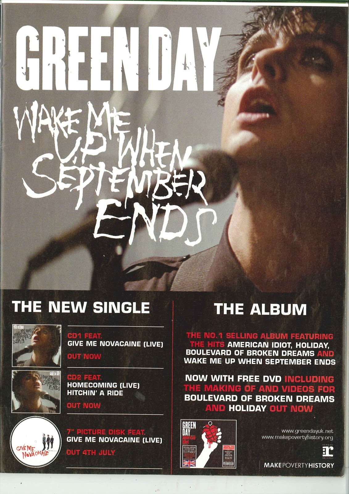
Green Day: Wake Me Up When September Ends
This advertisements image breaks convention completely, its slightly blurred and shows the main singer of green day in motion- as if the image is a still from when Green Day were performing, although I am not keen on the angle- I feel that it shows the bands image off as the main singer is seen to be wearing black, heavy eyeliner and black, spiky hair.
The font itself across the top half of the page is unconventional, this is as the font takes up more room than the image of the music artist, although it shows off the name of the band and promotes them well, I think that I would prefer a bigger image of the artist. I also like the use of the font for "Wake Me Up When September Ends" this is as it looks hand drawn and adds a personal touch to the poster. I also like the use of the red and white font, they contrast each other and connote danger against purity- this suggests the nature of the band- this is as it is punky- but still listened to by lots of young people.
Finally, I like the idea of the promotion across the bottom, with the new singles and the album- it makes fans know what the band are doing and when, it creates a fan base for the new album- meaning that the band would get more money back from the promotion.
Within the advertisement, I liked the use of promotion, this is as it makes the fan base known of the new songs and the album- it creates a fandom around the songs and albums.
Research: Music Advertisements: Rhianna- The New Album
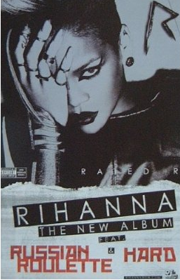
Rhianna- The New Album
This music advertisement is incredibly edgy and post- modern- Rhianna isn't representing a stereotypical image of femininity- instead she is breaking stereotypes. Rhianna isn't dressing this way to attract male attention- she is dressing this way for herself as a sign on her confidence.
However, the advertisement still adheres to convention, this is as she is looking directly into camera, I feel that this makes the article much more personal- the reader feels as though Rhianna is looking directly at them.
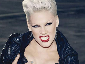
I also feel that this advertisement is intertextual- Rhianna is representing herself in a way that is similar to P!nk's identity- P!nk is a strong, punky individual- and within this image, Rhianna is trying to replicate this style.
Rhianna also breaks convention in the fact that the advertisement is black and white- it makes it appear slightly older- as if it was a music advertisement from the 80's, it also makes it appear more urban and modern- in a way these two ideas completely contradict each other- but this is the vibe that I get from the advertisement.
Rhianna also uses some red within her advertisement, red has connotations of danger and action- enhancing Rhianna's edgy image which she has created within the advertisement.
Within the article, I also like the font being within a banner for "Rhianna The New Album" and the fact that it is slightly at an angle within the page, it creates the idea of it being home made, along with the ripped paper, it creates the idea of it being like a home made band poster- almost suggesting Rhianna is a new music artist.
Within this advertisement, I like how post- modern it is, Rhianna represents herself as a strong, independent woman- this idea is also becoming more prominent with the idea of feminists- the way women are treated is becoming a big part of the media today.
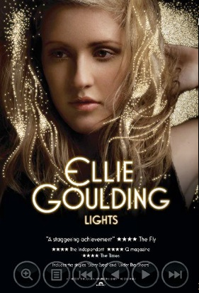
Research: Magazine Advertisements- Ellie Goulding- Lights
 |
| Ellie Goulding- Lights |
Ellie Goulding- Lights
Within this advertisement, I like the synergy between the idea of "Lights" for the title, and the glowing font and stars spread across the top third of the advertisement- it creates a sparkling, shiny effect. This advertisement was also printed on embossed paper, so the stars had a bit of depth to them as well and stood out from the rest of the page.
I also like the use of the gold across the page as it provides synergy and gold has connotations of luxury and expense- it adds vibrancy and creates the idea shining- like a star.
Within the advert, it adheres to Mulvey's male gaze theory, this is as it is quite voyereoustic- Goulding looks off page and it is also shot from quite a low angle- making her appear powerful within the frame.
The advertisement also breaks convention, this is as Goulding doesn't look into camera, instead she looks slightly away from the camera- this is considered a more flattering angle, and also makes the expression appear much more natural.
Within the advert, I also like the fact that the font is shadowed, it makes it appear 3D- as if the font is glowing, The font is also bigger in the title which makes it appear bold and eye catching. This font also stands out against the black background, the black background also provides a simple background for the font to be read to be read off. Hence, it makes it easier to read for people with different reading abilities.
Within this advertisement, I like the use of synergy- I feel that this is something that we could play around with with the symbols inside of the music video. I also like the use of a dark background with a light font- it is easy to read but it is still visually striking.
Research: Music Magazine Advertisements- Stereophonics
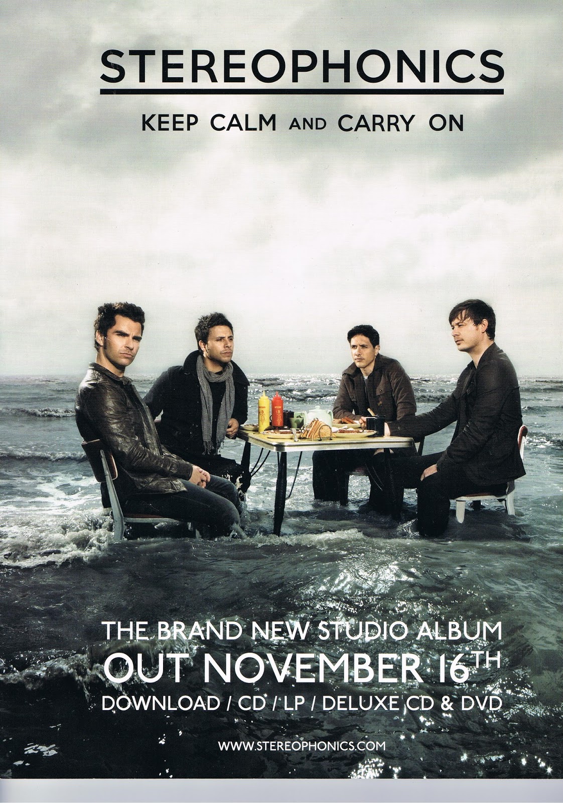 |
| Stereophonics- Keep Calm and Carry On music magazine advertisement |
Stereophonics- Keep Calm and Carry On
This advert takes up a full A4 page at the back of a music magazine, within this advert, I like the muted colour scheme, the use of the greys and the blues provides a tranquil colour scheme.
I also like how understated the advert is and the fact that it follows the rule of thirds, it makes the readers attention divert from the top to the bottom of the screen.
The advert itself also uses an unusual image, which contrasts with the calmer colour scheme and pushes the depth of the image. This image however, is clearly edited- it would be impossible to produce this image first hand and it was probably done on a blue screen. However, it does provide a unique image that catches the readers attention.
The advert itself is quite humorous, this is as it uses the popular catch phrase, "Keep Calm and Carry On" which is then illustrated by the fact that the image depicts the tide coming in- clearly a stressful situation, and Stereophonics are keeping that calm that they aren't really bothered by the predicament that they are in.
The advert also uses a simple font, that is large across the page- its dynamic and easy to read, the fonts are also in contrasting colours which provides a sense of depth and makes it appear bolder. The white font however, slightly blends into the white foam within the sea, which I am not keen on as it makes some aspects difficult to read, however, I feel that this effect would have looked better if the bottom half of the screen was all a dark colour- I.e. none of the white sea foam, although then you would have lost the effect of the raging sea. Finally , I like that the two fonts are parallel to each other, this is as it creates a mirrored effect, as If the font in the sea is a reflection of the font in the title.
From this advert, I like the effect of the use of thirds as I feel that it is a clever way of directing attention, I also like the use of the muted colour scheme with the brighter fonts in the middle as I feel that it makes the advert more dynamic and eye catching.
Planning: Media Music Video Script
Scene 1: Indya walking along a street, someone in a hoodie
knocks her, her headphone falls out, she puts her headphone back in and the
music starts.
Scene 2. Indya walks whilst performing into camera, use of
varying shots in order to create more attitude, wearing fairly modern and
simple clothing.
Scene 3: Modern Scenario- dark lighting and dark clothing
for everyone except Indya
Scene 4: Close up of someone playing a guitar- hands on
strings
Scene 5: POV shot from a bike looking onto a rusty looking
bike, filmed on a public footpath in older clothing.
Scene 6: Indya and 7 other sat round a radio- interacting
listening to music, possibly another person sat in dark, modern clothing
listening to music through their headphones.
Scene 7: Robbie dressed as an accountant getting out of a
fancy car and acting like he’s on the phone to someone, as he puts the phone
down to end the call, the word media is written across the screen
.
Scene 8: Indya sat at one of the Mac’s typing I know
everything on the screen.
Scene 9: Indya walking along listening to music, her costume
begins to change- for instance, this time the flowers began to appear in her
hair and she’s wearing eye liner.
Scene 10: Modern Scenario- everyone wearing dark clothing-
except Indya, who is wearing the adjusted outfit.
Scene 11: Everyone sat round tents in the garden, having
fun- dancing and interacting- no phones, they’re ignorance and don’t give a
care about the world around them.
Scene 12: Indya singing into camera down a side street in
Brigg, with a British flag around her (holding it)
Scene 13: Indya finds an old photograph, as the old
photograph is zoomed into, the picture turns to like- could either be focused
on one couple surrounded by others having a good time
Scene 14: Close up of someone posting a letter
Scene 15: Indya performing into camera, flowers appear
behind her, more vibrant- costume alters again, this time she changes to a
darker t-shirt and black jeans- or a bright t-shirt.
Scene 16: Indya flicking through vinyls in an old cardboard box-
as if she’s just found them.
Scene 17: Time lapse stood at the motor way bridge of both
the cars and the clouds
Scene 18: Shot of two people wearing oversized t-shirts that
are a bit muddy- either freeze frame or having a kick about?
Scene 19: Football match- POV shot of the ball going over
the match using a tiny camera- pans round to the crowd cheering
Scene 20: Performance shot again- of Indya- this time with
everybody stood behind her having a good time, then flicks to everyone wearing
hoodies in the background and back again, this time Indya’s costume is fully
changed- could have a leather jacket and a chunky necklace
Scene 21: Final shot slowed down of Indya singing as
balloons are released behind here- possibly red, white and blue balloons to
match the flag, and a couple of black balloons to focus in on in the end-
represents the idea of her being an individual.
Sunday 20 September 2015


Friday 18 September 2015


Tuesday 15 September 2015
Reseach: Spotify VS ITunes
At current, Spotify has 60 million users, 15 million of which are paid subscribers, meaning that they don't have to watch the adverts and can listen to the music without a wi- fi connection. Spotify has around 20 million songs- spread across a wide range of genres, and around 20,000 songs are added on average everyday and Spotify has around 1.5 billion play lists. However, Spotify has had to pay out around $2 billion in publishing rights. Around 5 million playlists are created everyday and Spotify has access to 12 billion hours of music.

ITunes however, has around 800 million users and the details of around 400 million credit cards. ITunes had around 25 billion songs and the average iTunes user spends around $40 a year on ITunes. Around 15000 songs are downloaded every minute! In the iTunes catalogue, there are 26, 000 songs. ITunes is available in 119 countries.
In conclusion, at the minute, ITunes is the biggest company, particularly as it is part of the apple franchise which is incredibly popular with phone and computer sales. Plus, ITunes is available to a wider number of countries. Spotify cost £4.99 a month which translates to around £60 a year, this works out on average more than ITunes, and for Spotify, this price means that you can listen to any song you want to!. Also, in the iTunes catalogue at current, there are 26000 songs, and 20 000 are added to Spotify every day- making it a larger company in terms of the music owned, but Spotify has had to spend $2 billion on publishing rights. At the minute, ITunes is a much larger company, however, it has been established longer, I feel that Spotify will gain more popularity and will eventually become more popular than iTunes as I feel that ITunes is slowly becoming out of fashion and on average, Spotify is better value for money in my opinion.
Planning: Sandi Thom- Punk Rocker Lyrics
Oh I wish I was a punk rocker with flowers in my hair,
In '77 and '69, revolution was in the air,
I was born too late, into a world that doesn't care,
Oh I wish I was a punk rocker with flowers in my hair,
In '77 and '69, revolution was in the air,
I was born too late, into a world that doesn't care,
Oh I wish I was a punk rocker with flowers in my hair,
When head of state didn't play guitar, not everybody drove a car,
When music really mattered and when radio was king,
When accountants didn't have control, and the media couldn't buy your soul,
And computers were still scary and we didn't know everything,
When music really mattered and when radio was king,
When accountants didn't have control, and the media couldn't buy your soul,
And computers were still scary and we didn't know everything,
Oh I wish I was a punk rocker with flowers in my hair,
In '77 and '69, revolution was in the air,
I was born too late, into a world that doesn't care,
Oh I wish I was a punk rocker with flowers in my hair,
In '77 and '69, revolution was in the air,
I was born too late, into a world that doesn't care,
Oh I wish I was a punk rocker with flowers in my hair,
When popstars still remained a myth, and ignorance could still be bliss,
And god save the queen, she turned a whiter shade of pale,
My mum and dad were in their teens and anarchy was still a dream,
And the only way to stay in touch was a letter in the mail,
And god save the queen, she turned a whiter shade of pale,
My mum and dad were in their teens and anarchy was still a dream,
And the only way to stay in touch was a letter in the mail,
Oh I wish I was a punk rocker with flowers in my hair,
In '77 and '69, revolution was in the air,
I was born too late, into a world that doesn't care,
Oh I wish I was a punk rocker with flowers in my hair,
In '77 and '69, revolution was in the air,
I was born too late, into a world that doesn't care,
Oh I wish I was a punk rocker with flowers in my hair,
When record shops were still on top, and vinyl was all that they stocked,
And the super-info highway was still drifting out in space,
Kids were wearing hand me downs, and playing games meant kick around,
And footballers still had long hair and dirt across their face,
And the super-info highway was still drifting out in space,
Kids were wearing hand me downs, and playing games meant kick around,
And footballers still had long hair and dirt across their face,
Oh I wish I was a punk rocker with flowers in my hair,
In '77 and '69, revolution was in the air,
I was born too late, into a world that doesn't care,
Oh I wish I was a punk rocker with flowers in my
I was born too late, into a world that doesn't care,
Oh I wish I was a punk rocker with flowers in my hair.
In '77 and '69, revolution was in the air,
I was born too late, into a world that doesn't care,
Oh I wish I was a punk rocker with flowers in my
I was born too late, into a world that doesn't care,
Oh I wish I was a punk rocker with flowers in my hair.
Monday 14 September 2015

Planning: How have music videos changed over time?
How have music videos changed over time?
Music videos have vastly changed over time, for me I feel that this is mainly due to technology- technology has slowly become more and more advanced. Music artists now have access to a wide range of technology, such as blue and green screens, CGI, digital software/ technology and countless forms of editing software. This has lead to better quality image and sound. Music videos have also changed purpose, in the past, music videos were mainly used for performance and were fully performance based. This is as music festivals and concerts were few and far between, meaning fans didn't have access to the musicians they wanted to see. Instead, these live performances were filmed and published, meaning fans could see their favourite artists live.
Music videos have vastly changed over time, for me I feel that this is mainly due to technology- technology has slowly become more and more advanced. Music artists now have access to a wide range of technology, such as blue and green screens, CGI, digital software/ technology and countless forms of editing software. This has lead to better quality image and sound. Music videos have also changed purpose, in the past, music videos were mainly used for performance and were fully performance based. This is as music festivals and concerts were few and far between, meaning fans didn't have access to the musicians they wanted to see. Instead, these live performances were filmed and published, meaning fans could see their favourite artists live.
Sunday 13 September 2015
Planning: finding a singer
 Within our music video, our friend Indya has said that she will sing, we think that she is a great choice for our music video.


Friday 11 September 2015
Monday 7 September 2015
Research: P!nk - So What Music Video- Secondary Sources
The P!nk- So What music video is a Pop- Rock Music Video and follows some stereotypes of the music genre, within the music video itself, the establishing shot shows P!nk getting a tattoo, with the lettering VOID over her ex partners name. This introduces the concept of the music video being about a break up, however, tattoos are also a stereotype of the rock genre.
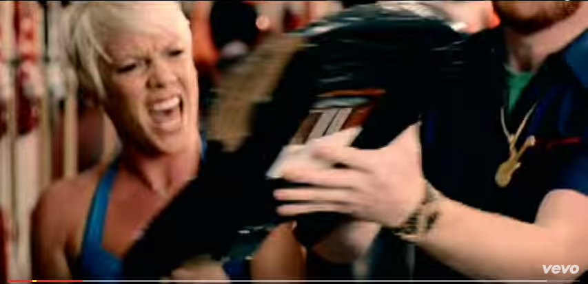

Pink is also shown to sing into camera, the majority of the time and is shown wearing fairly provocative clothing- in fact at one point she is naked. This supports Laura Mulvey's male gaze theory. However, I feel that P!nk wears this sort of clothing as she is confident in herself and her sexuality- it gives P!nk an edgy identity. I feel P!nk wears this clothing because she wants to- not to attract male attention. Due to her provocative clothing, the music video is very voyeuristic, there are also scenes involving pillow fights in the bedroom with lots of men, however, once again I feel that this is to show Pink as a dominant individual, she wears the clothes that she does, in order to assert her power and confidence. In terms of intertextuality, there are many references, for one, the music video uses P!nk's actual ex husband, whilst newspaper headlines about P!nk are played in the background, the fact P!nk uses these in the background of her music video shows that she isn't ashamed of what the media says about her, this is also shown by her nudity on the red carpet, P!nk is showing the media where she is and who she is, she isn't ashamed of her brand image. Also, P!nk shows a wedding car in the video, whilst she rebels, on her own next to it, P!nk breaks convention, this is as she goes against the idea of having a perfect wedding, in P!nk's opinion, the happy ending doesn't always occur. Finally, the music video is mainly concept and performance based, it doesn't follow a chronological story and the majority of time, P!nk sings to camera.
Within P!nk's actual name, she uses a !, this symbolises P!nk's identity, P!nk is striking and confident, she provides an impact, it also symbolises P!nk's rebellion, she isn't afraid to stand out from the crowd.
How Research has informed my planning and creativity: Within the video, it has become clear to me how important brand image is, however, due to the delicacy of our song, I feel that we need a more subtle brand image- one that many teenagers can relate to.
Subscribe to:
Posts (Atom)