Star Records
Within this logo, I like the simplicity of the name itself, I think that Star Records is easy to remember, I also like the simplistic logo, however I feel that the font itself loos quite scruffy- and I would be better recreating this logo on the computer to create a more polished look. I also like the subtle colours within the logo itself, this is because it almost gives the logo a 3D edge. I think the fact the font is joined up slightly works well too and I like the effect this created, however I took the "star" font from the star wars logo, so would need to change this if this is the design we choose to use.
Ocean Music
Once again, I like the simplicity within the record label name as I think that it is memorable, I also took inspiration from Oasis' band logo for this, however, I feel that I would need to recreate this logo on the computer to see its potential, I would also prefer to only use one font throughout the logo as I feel that the two different ones makes the logo appear disjointed. However, I do like the monochrome colour scheme as I feel that on the computer, this would make the logo appear sleek.
Phantom Records
Within this, I like the juxtaposition created, with the idea of a phantom being scary with the childish like writing. I also like the effect created by the multi layering of the colours within the text itself as I feel that it gives it a layer of depth and makes the text appear 3D as if it is coming off the page, I also feel that the cartoon ghost gives the logo some character and makes the record label appear more inviting and friendly.
Youth Records
Within this Label, I deliberately tried to make it appear messier in order to create a graffiti like text, I also used typical bubble writing and contrasting colours within this text to make it bolder and brighter. I think I would try and recreate this on the computer, however, I would like to play around with different fonts and paint patterns in order to create new and interesting effects to see which looks best, as I feel that it looks fairly messy at the moment, so it should look better on the computer.
Final Thoughts
In order to work out which design is the best, I feel that the best thing to do would be to hand out the designs as a questionnaire, this is as it would give us a better idea of what our target market want, we could perhaps do one for the actual style used and one for the name of the record label, this is because it would enable us to create a better combination of the style and font itself in order to create a more appealing design.
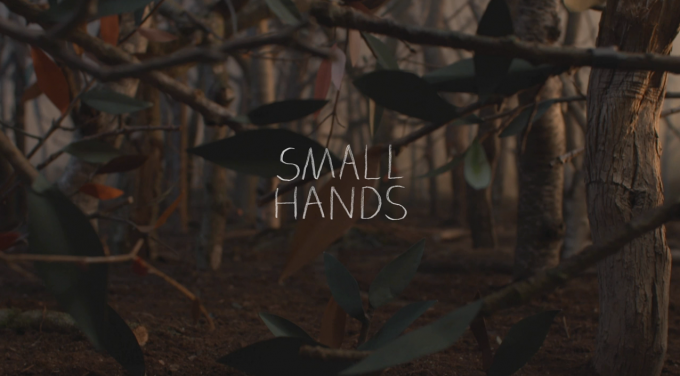
Keaton Henson's Small Hands music video is Post Modern- it features ideas and concepts that many people don't want to face, In Keaton Henson's music video, he uses animal puppets that act as a metaphor for the way humans are, and the idea that something can change our lives in an instant- a concept that Keaton Henson makes literal within his music video.
The music video itself also features dark colours, these provide quite an eerie and cold atmosphere, however, the pops of deep auburn and orange within the music video suggest a forest type location- as well as the fact that they begin to connote Autumn.
Within the music video, a series of stylised puppets are used, the entire music video is filmed in stop motion, almost creating a child like fairy tale, however, this fairy tale has a much darker meaning. The music video itself requires an active audience.
The music video itself can be associated with Todorov, this is as the music video follows the idea of telling a story- however, it is purely concept based, and only follows the equilibrium and disequilibrium stage.
Within the music video, I particularly like the introductory credits, this is as they start with an establishing shot in the background, showing the cleverly created stop motion background. I also like the actual text that is overlaid in the credits, I like the fact that the writing isn't joined up, and it is childish like writing- it is also quite sketchy and appears to look hand written.
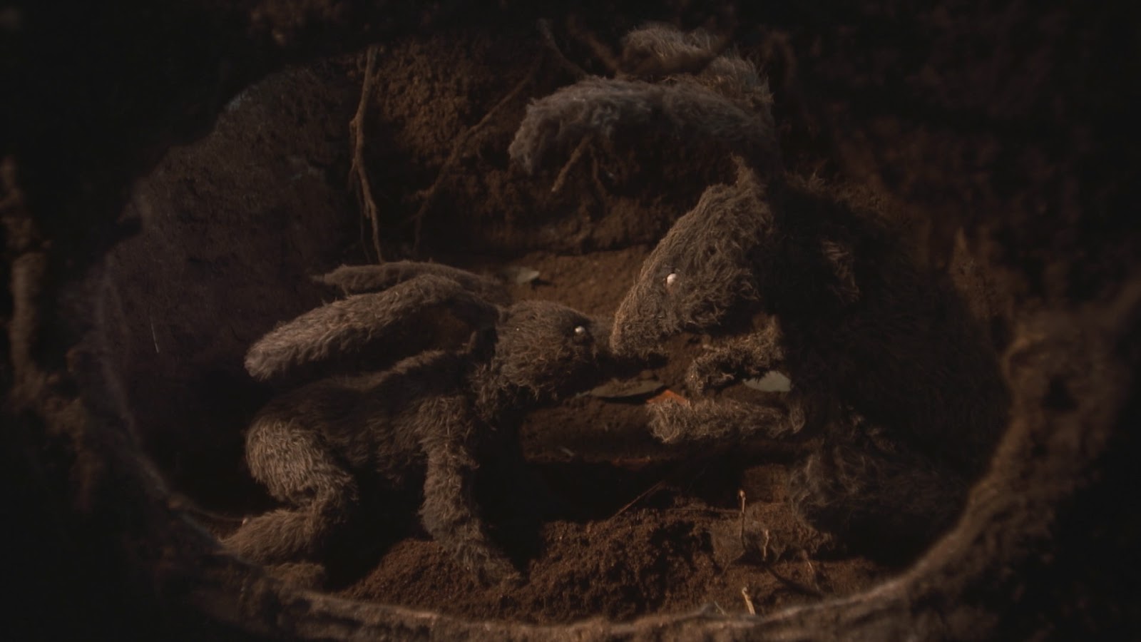
Within the equilibrium stage of the music video, close up shots of different pairs of animals are used, which appear to show the animals interacting with each other, beautifully portrayed in stop motion, making the movements of the animals appear seamless. However, the sense that something bad is going to happen occurs through the music video as it all appears dimly lit and all of the music video is filmed in natural colours, such as browns, greys and greens. I also like the fact that the couples are often shown
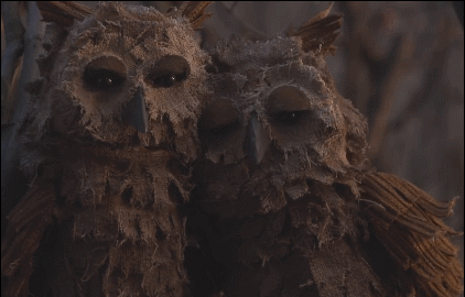
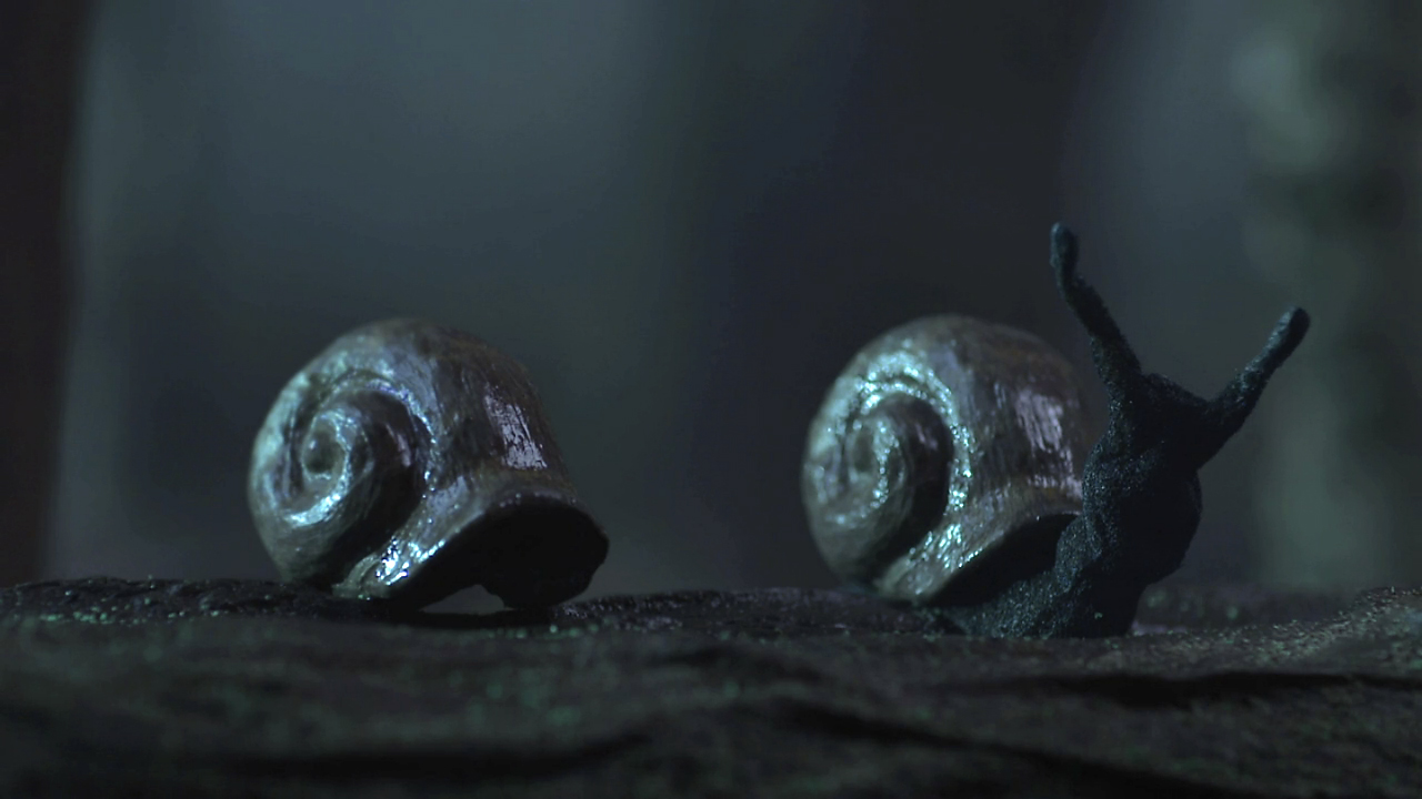
centre framed. Here is a GIF I found showing online showing one of the shots within the film. Within the music video, I feel that the couples are meant to symbolise ordinary people, all of the animal couples filmed at the beginning appear to be in a state of paradise, nothing appears to be wrong. This connotes the idea of us being naïve and that we don't like to face the idea of things being wrong. The pairs of animals used within the video are Owls, Rabbits, Frogs and Snails.
Within the shots themselves, a soft focus is used,
this makes the animals within the shots stand out, it makes the audience's attention focus on the animals, giving them the sense of naivety as they aren't focusing on what is occurring elsewhere.
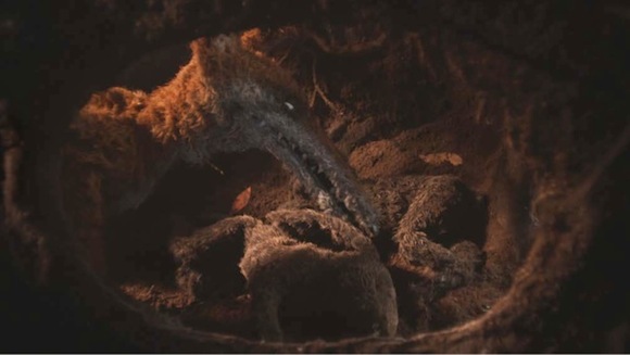
Disequilibrium then begins to occur within the music video, when a series of murders occur, although these deaths are natural in the wilderness and people don't normally take a second glance. The symbolism in the music video makes it appear all the more sinister. The most obvious murder shown is the fox, stealing the rabbit, the framed burrow makes the audience feel like an onlooker- as if they are almost there. The murders juxtapose the sweet melodies within the music. One of the less
murders is that of the Owl, a series of footsteps shown suggest that it is done by a human and series of feathers falling suggest that the owl has been killed. However, this scene requires an active audience, as unlike the rabbit, the Owls death isn't completely obvious to the viewer, it is used subtly and although there is a dark nature to it, the music video is still beautiful.
The final scenes of the music video are extremely dimly lit and the scenes all have a blue tint to them, connoting the feeling of sadness. Here is another GIF I found, a close up of the rabbit framed to the right, giving the impression that the other rabbit would be framed to the left, the fact that the rabbit is shivering also suggests that the rabbit is alone, and no longer has someone to comfort them. This symbolises grief and shows how life can change in an instant because of situations that you cannot control.
In the next scene, the camera zooms into the owl, showing him sitting alone on the branch, the feather to the right of the branch symbolises the death of the other owl, and the white connotes its purity. The fact that the owl has its head bowed suggests further sorrow and creates the idea of loneliness as he no longer has his partner to sit with.
One of the most striking shots I feel is this of the two snails and the fact one of the shells is left behind. In a way, I feel that this symbolises the idea of memories, as to the other snail its as if his partner is still there, when he isn't. This is an incredibly moving and striking music video, and definitely requires an active audience.
Intertextuality
In terms of intertextuality, I feel that the Music Video for "Small Hands" by Keaton Henson was heavily influenced by Bjork's Human Behaviour music video- which was directed by Michel Gondry. Bjork is also a post modern music artist.
This was Bjork's quote on working with Gondry that was released in an interview with Rolling Stone Magazine.
"'Human Behaviour' is an animal's point of view on humans. And the animals are definitely supposed to win in the end. So why, one might ask, is the conquering bear presented as a man-made toy? I don't know. I guess I just didn't think it would be fair to force an animal to act in a video. I mean, that would be an extension of what I'm against. I told him [Gondry], 'I want a bear and textures like handmade wood and leaves and earth, and I want it to seem like animation.' Then I backed out."
Bjork's music video "Human Behaviour" follows an animals perspective, however, the puppets within the music video are also incredibly child like, making the video seem more enchanting. I also like the idea behind using the puppets within the music video, the idea Bjork thought it wouldn't be "fair to force ananimal to act in a video". Hence the idea that Bjork was at the same time making a statement about the treatment of animals and how it isn't fair to force animals to do things that they can't consent to- promoting Bjork as being very post modern.
The one difference I did note between the two artists was the use of colour within the music videos, Bjork uses lots of heavy saturated colour in order to create a child- like world- making the story seem more enchanting. Whereas Keaton Henson uses a much darker more natural colour scheme, which creates a more solemn attitude. It just goes to show how much colour and lighting can effect the mood of a scene.
Bricolage
Bricolage is often used in practical art and fine art and is refined to as DIY Art- many of the objects and props used are home made and made from different everyday objects. Both Bjork and Keaton Henson use bricolage in order to create a unique and handmade image- it makes the images look more childlike and fairytale esque.
How Research has informed my planning and creativity: I love the way that the puppets have been used, however, in the limited period of time we have, I feel that this would be difficult to create, I also like the conceptual basis of the song, and how different images can create different feelings- I feel that I could work with this concept in our music video.
Starbucks hand out free song download tokens, in connection with itunes- I thought that this could be an idea- this is as it would use cross media promotion, aswell as being a way of using new technologies in terms of promoting a band


 Youth Records